Deliverables:
Mobile website
Timeframe:
April - May 2024

Good coffee

made easy

Design of an e-commerce platform
ABOUT

Kava is an e-commerce platform that enhances the coffee experience with expert guidance, educational resources, and curated products for every step of the coffee journey.

THE PROBLEM
Research identified a significant gap in the coffee e-commerce market: existing platforms often overwhelm users with complex terminology, making it challenging for the average consumer to make informed purchasing decisions.
THE SOLUTION
The challenge is to bridge this gap by creating an interface that educates users on coffee varieties and brewing methods, empowering them to confidently choose the perfect brew.

1

DISCOVERY
  • market analysis
  • user needs

2

DEFINING
  • concept
  • user flow
  • lo-fi wireframing

3

DESIGN
  • visual directions
  • branding
  • hi-fi screens

4

PRODUCT
  • prototyping
  • user testing
  • iterating

1

DISCOVERY
  • market analysis
  • user needs

2

DEFINING
  • concept
  • user flow
  • lo-fi wireframing

3

DESIGN
  • visual directions
  • branding
  • hi-fi screens

4

PRODUCT
  • prototyping
  • user testing
  • iterating
MARKET ANALYSIS
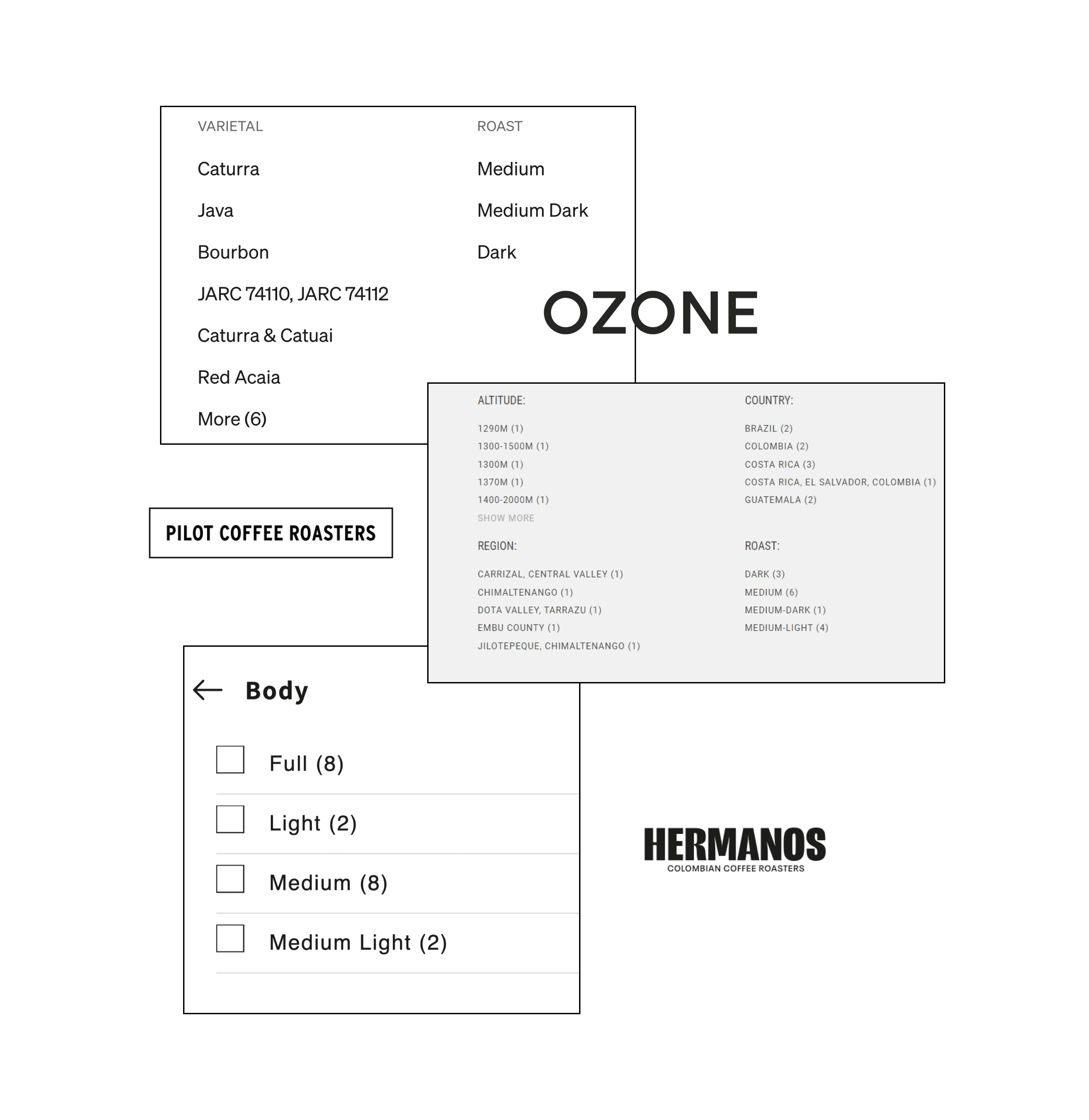
An investigation into several coffee e-commerce platforms reveals a significant gap in user guidance and information provision.
LACK OF DESCRIPTIONS
Insufficient or vague product descriptions leave customers uninformed about coffee varieties, flavor profiles, and brewing methods.
CONFUSING TERMINOLOGY
Complex terminology related to coffee, such as roast levels, origins, and processing methods, is not adequately explained.
LIMITED EDUCATIONAL RESOURCES
There is a scarcity of educational materials to help customers select the right products based on their preferences and learn more.
FILTERING
FILTERING
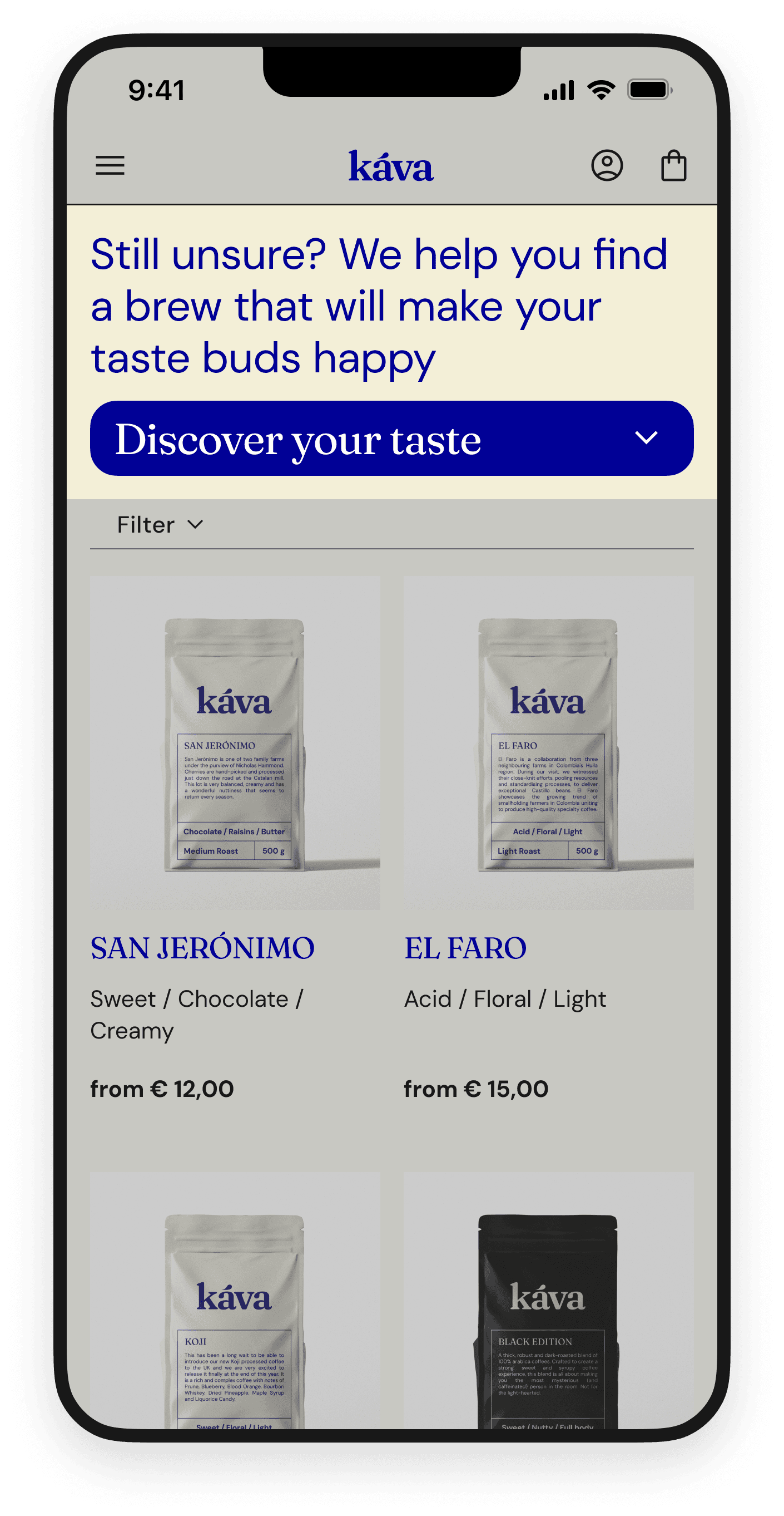
While filters are available to streamline product searches, they often confuse coffee novices, leading them to ask:
What am I supposed to choose in this sea of options and terms I do not understand?
As a result, users frequently turn to external sources for information, disrupting their shopping experience and potentially causing disengagement.
To address this challenge, we defined the user story:
As a coffee lover, I want to be able to purchase coffee from an e-commerce website easily, search for products, and view their details so that I can make informed purchase decisions.
BUILDING EMPATHY
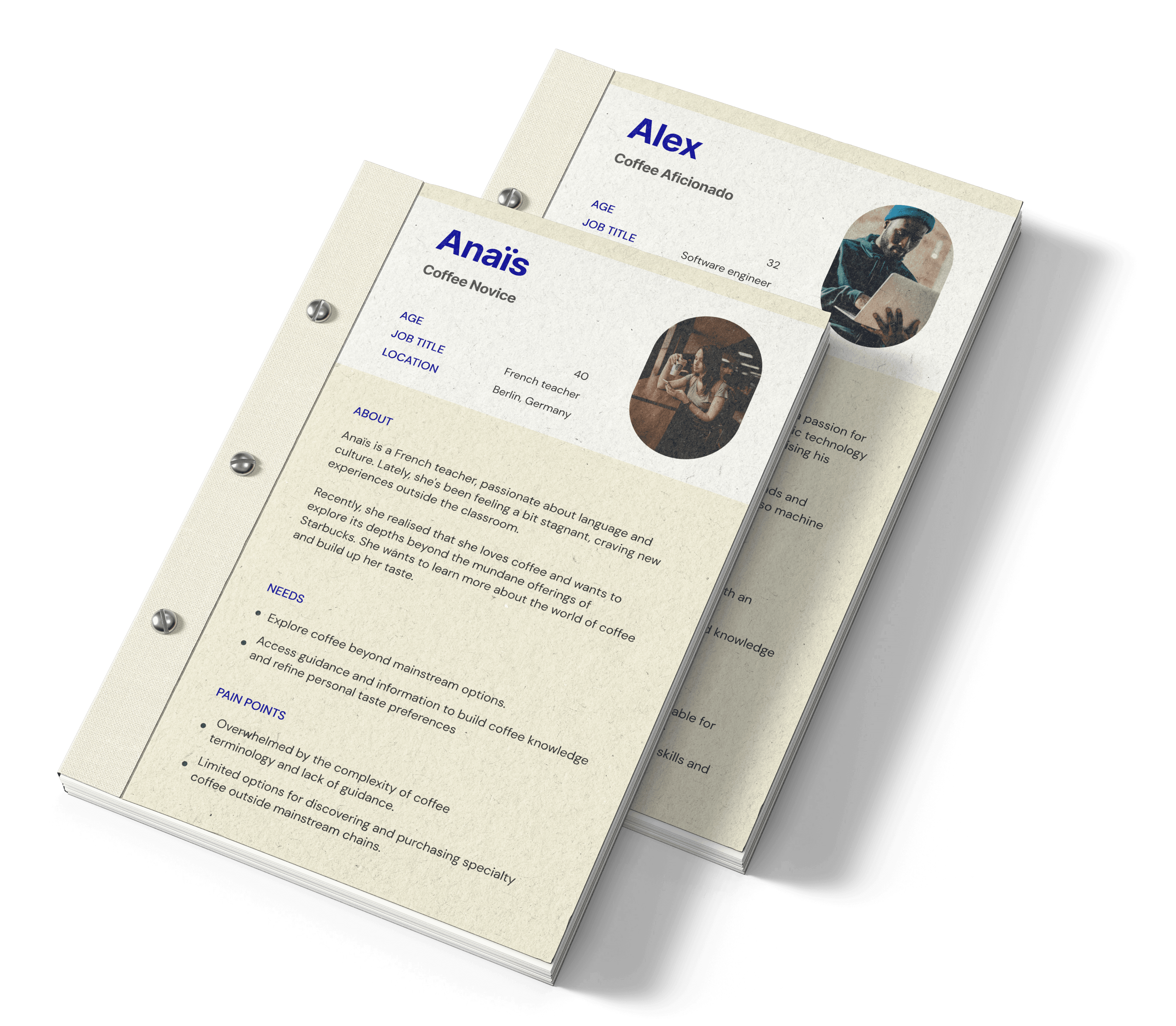
Two user personas, Anaïs and Alex, were created to represent distinct segments of coffee enthusiasts.
Anais is new to the world of coffee and seeks guidance.
Alex already possesses a level of expertise and craves new experiences.
Since the aim is to make the buying process intuitive and accessible to everyone, it was important to cater to beginner’s needs first. Therefore, for the rest of the development, the focus was placed on the persona of Anaïs.
DESIGN PRINCIPLES
Keeping the main goal in mind, which is empowering and guiding the user through the purchase flow, we defined the design principles that will guide us throughout the development of the product.
WE ENABLE DECISION MAKING
Users should be guided through the purchasing process with informative descriptions and recommendations to help them choose the right coffee.
CONTENT GIVES MEANING
Ensure that content (visual and textual) is informative and enhances user understanding.
COFFEE IS PLEASURE SO SHOULD THE BUYING PROCESS
The interface should be warm and friendly, making the experience enjoyable.
BRAND IDENTITY
Our goal in shaping the visual directions was to capture the delightful sensation of enjoying a favorite cup of coffee on a sunny day.
We want our design to radiate friendliness and happiness akin to the pleasure coffee brings.
BRAND IDENTITY
Our goal in shaping the visual directions was to capture the delightful sensation of enjoying a favorite cup of coffee on a sunny day.
We want our design to radiate friendliness and happiness akin to the pleasure coffee brings.
COLOUR PALETTE
Creamy Ivory
#F3EFD7
Saffron Mango
#FCC950
Sunburst Yellow
#F5AD04
Navy blue
#000096
Ecru White
#FAFAF3
White
#FEFEFC
Black
#181818
COLOUR PALETTE
Creamy Ivory
#F3EFD7
Saffron Mango
#FCC950
Sunburst Yellow
#F5AD04
Navy blue
#000096
Ecru White
#FAFAF3
White
#FEFEFC
Black
#181818
TYPOGRAPHY

Fraunces

Fraunces

Fraunces is a display, "Old Style" soft-serif typeface inspired by the mannerisms of early 20th century typefaces.

DM Sans

DM Sans

DM Sans is a low-contrast geometric sans serif design, intended for use at smaller text sizes.
Fraunces Regular

Fraunces Regular

Good coffee made easy

Good coffee made easy

Fraunces Semibold

Fraunces Semibold

Good coffee made easy

Good coffee made easy

DM Sans Regular
DM Sans Regular
Good coffee made easy

DM Sans Bold

DM Sans Bold

Good coffee made easy

Good coffee made easy

LOGOTYPE
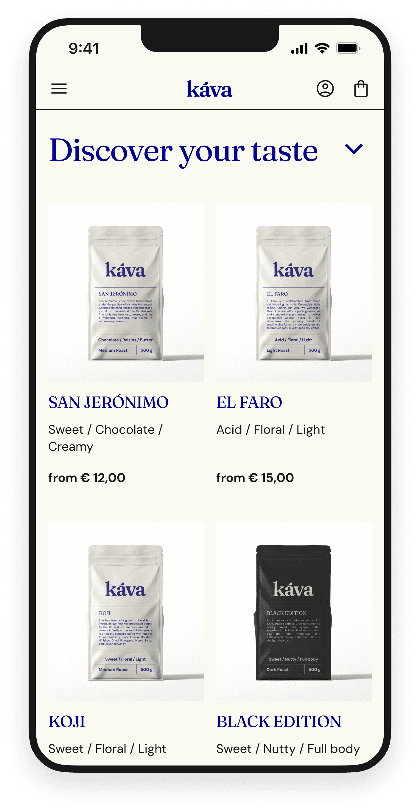
GUIDED SHOPPING EXPERIENCE
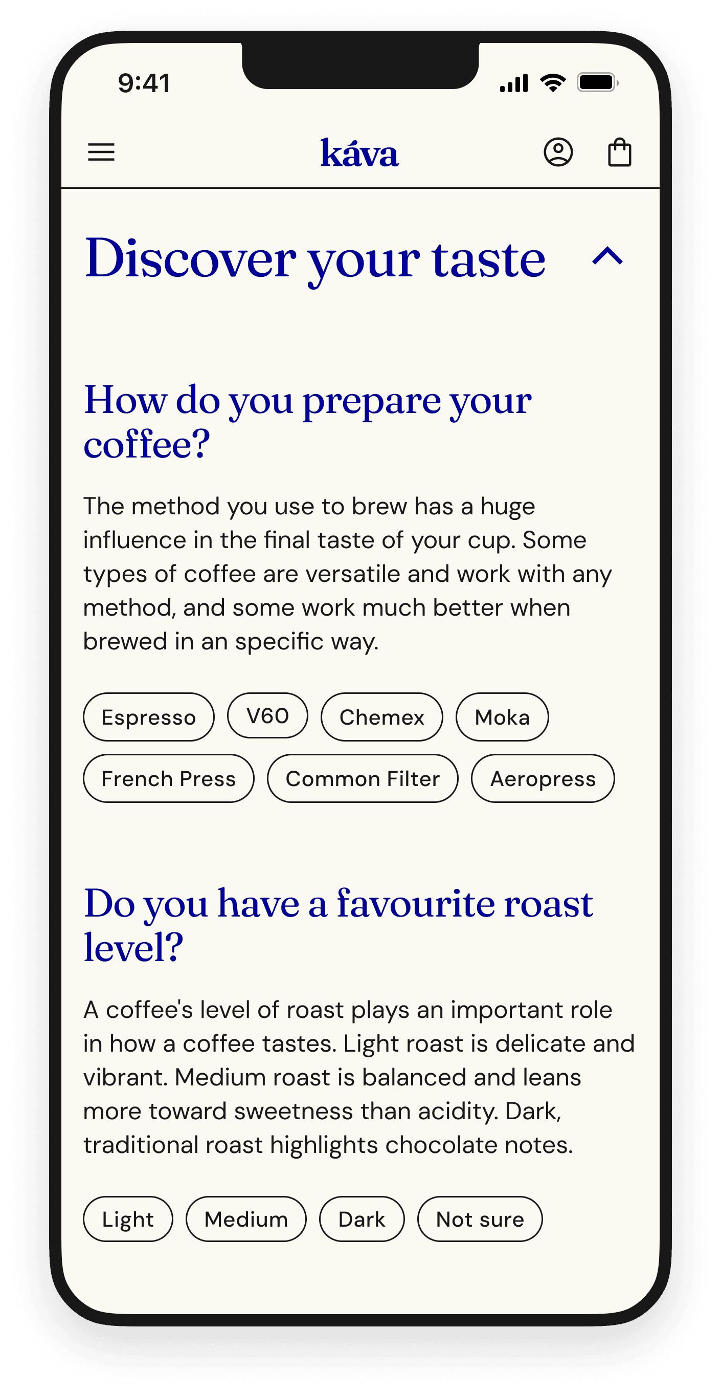
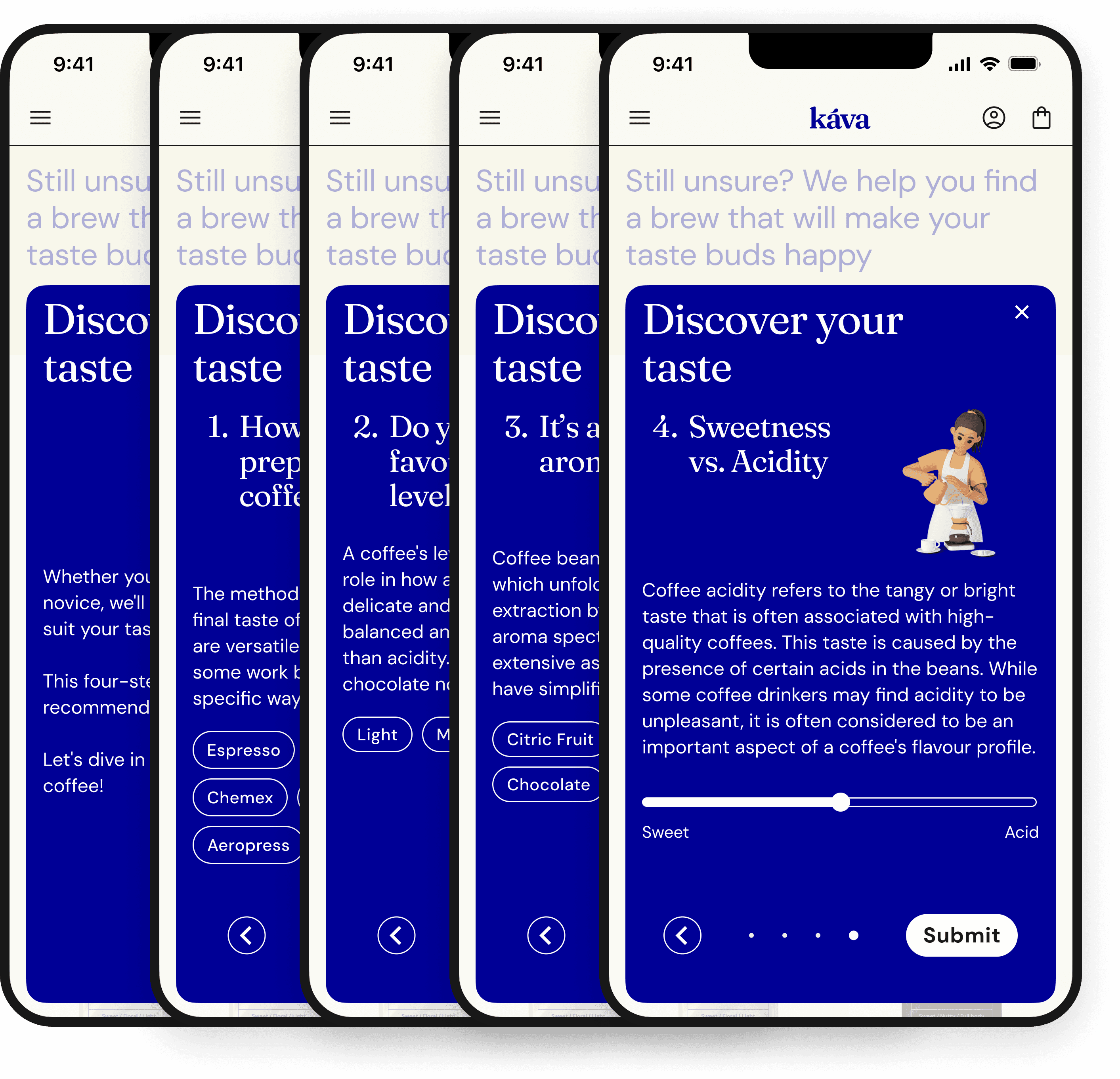
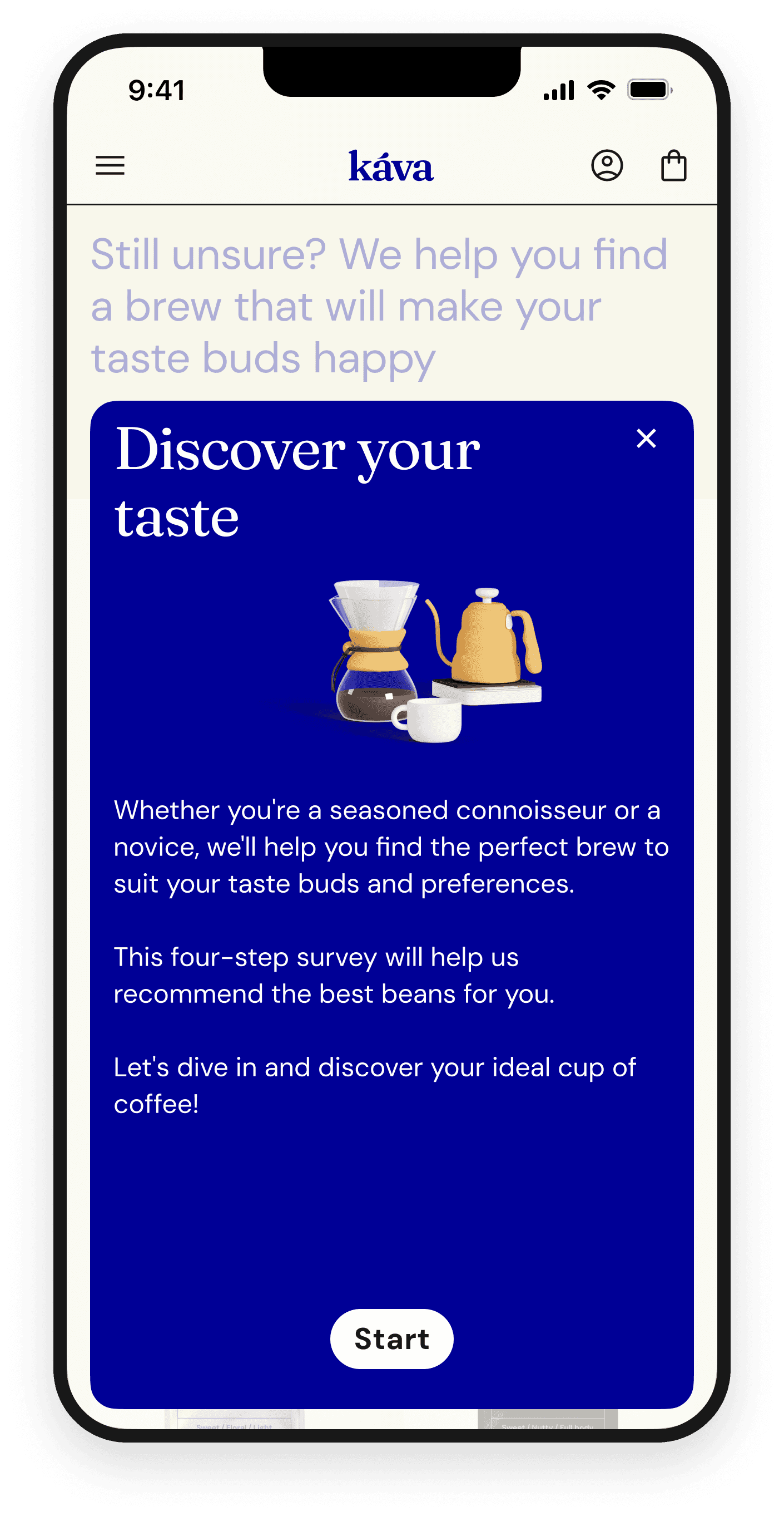
Discover your taste” filter in form of 4 questions that guides the user through the smooth shopping experience.
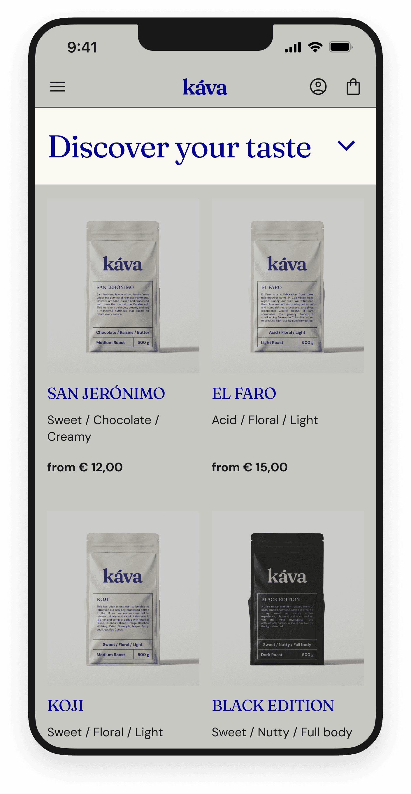
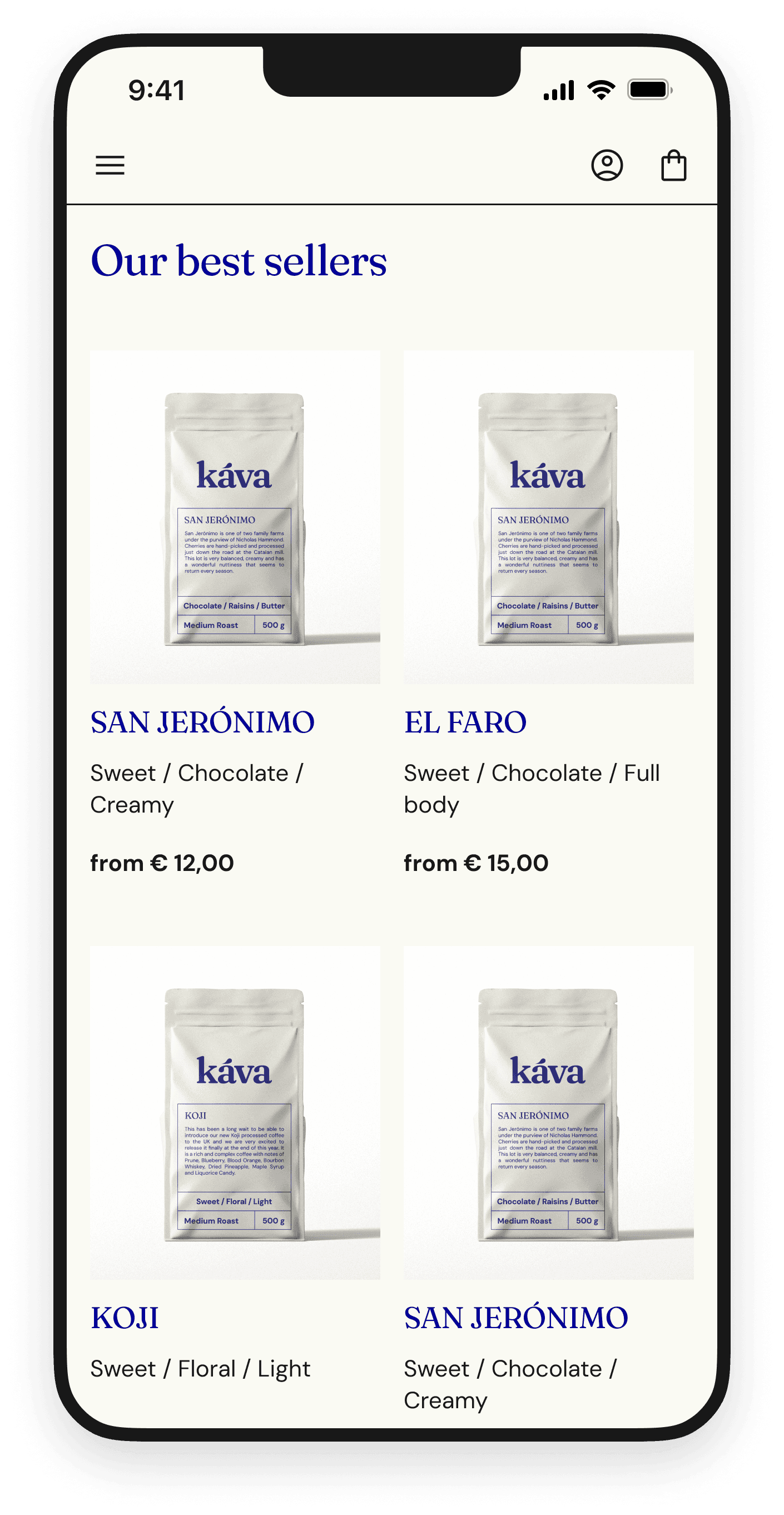
PRODUCT LISTING PAGE
This tool has been integrated directly into the product listing page, ensuring that users have immediate access to personalized guidance without navigating away from their browsing session.
DROPDOWN FILTER
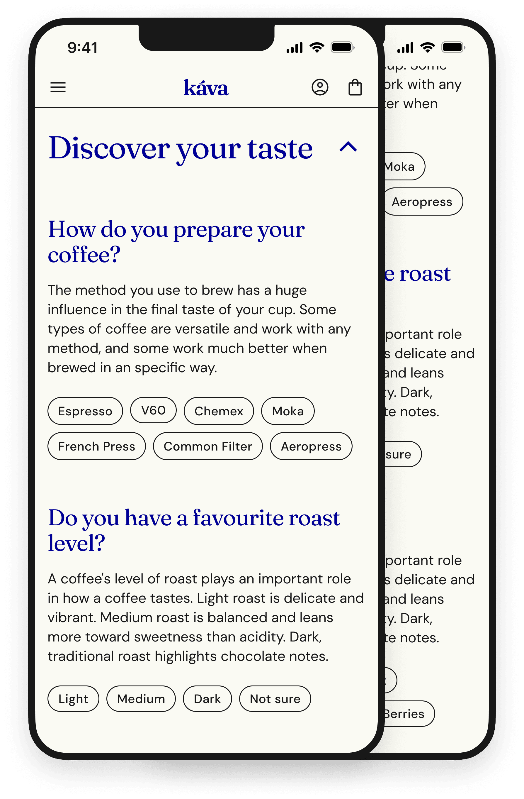
The filter serves as an interactive solution, guiding users through a series of questions designed to identify their specific preferences, such as roast level, flavor profile, and brewing method.

With each question answered, the user is provided with clear explanations to aid in their decision-making process.
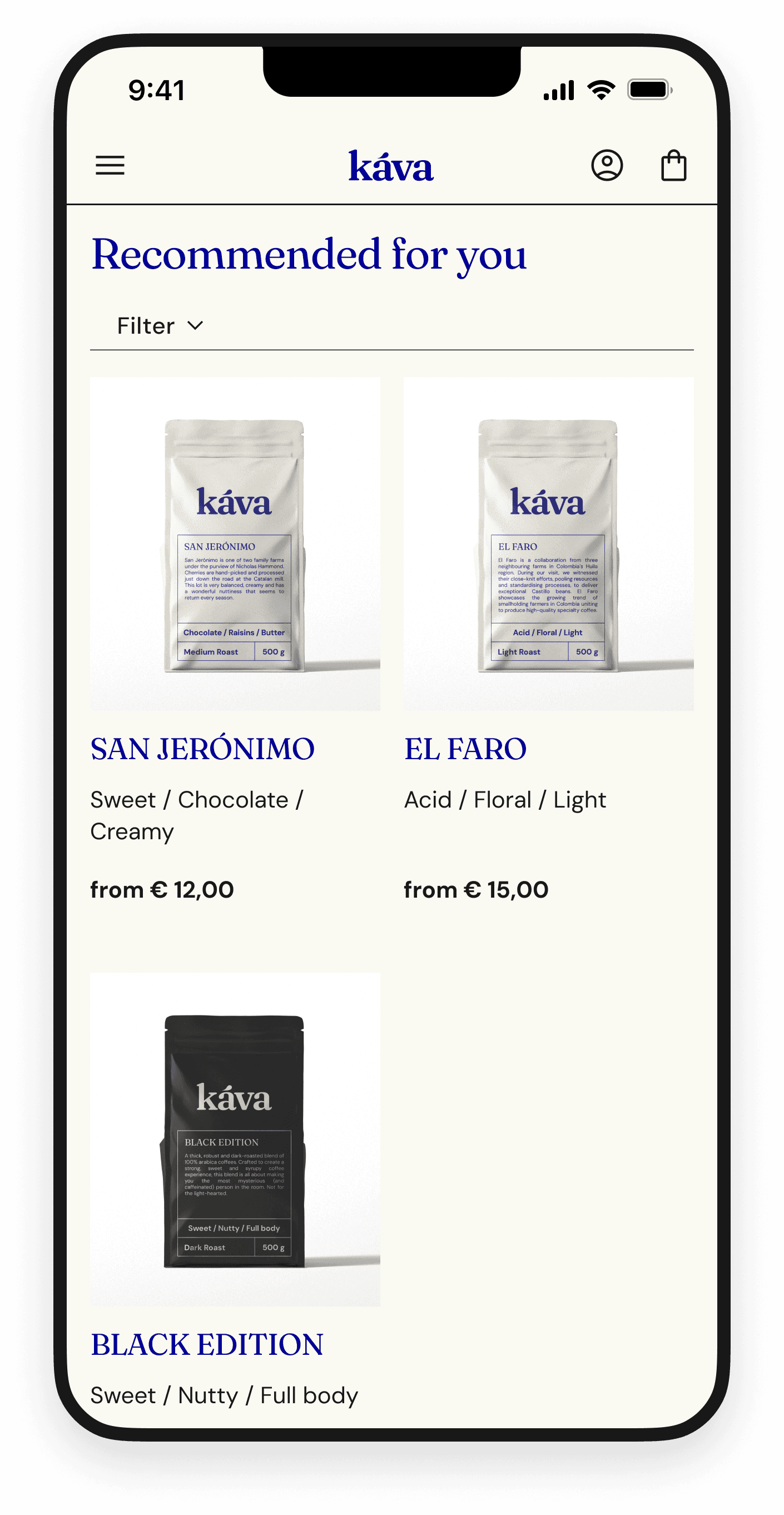
PERSONALISED PRODUCT LIST
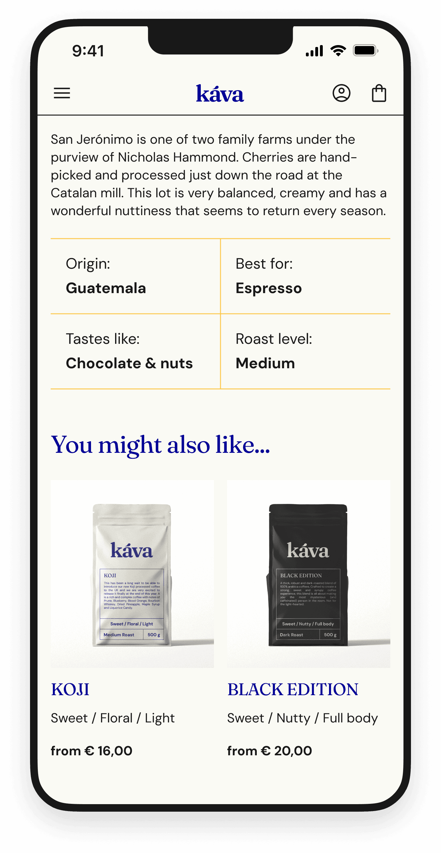
Upon completion of the quiz, the user is presented with a personalized list of coffee products that precisely match their identified needs and taste preferences.

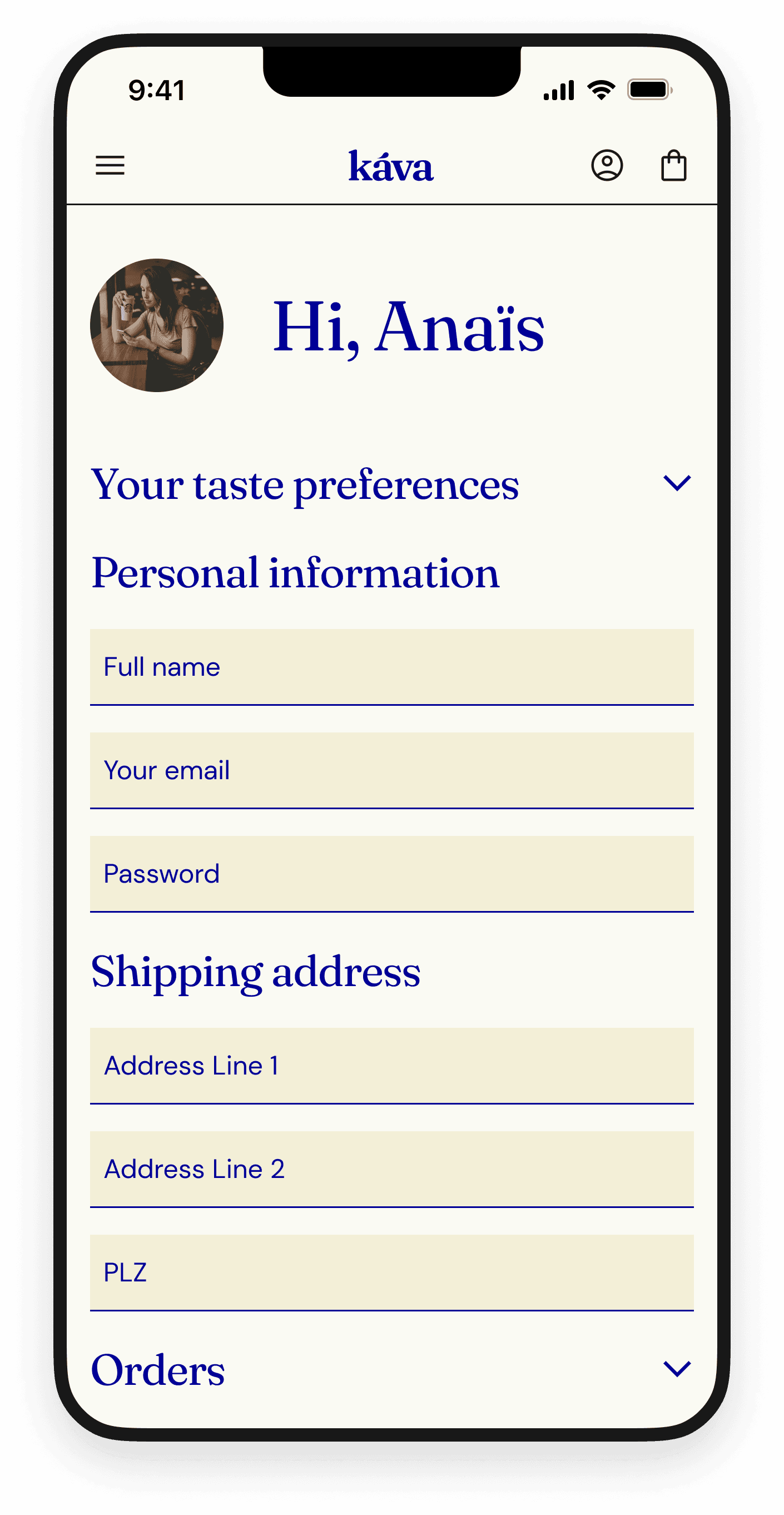
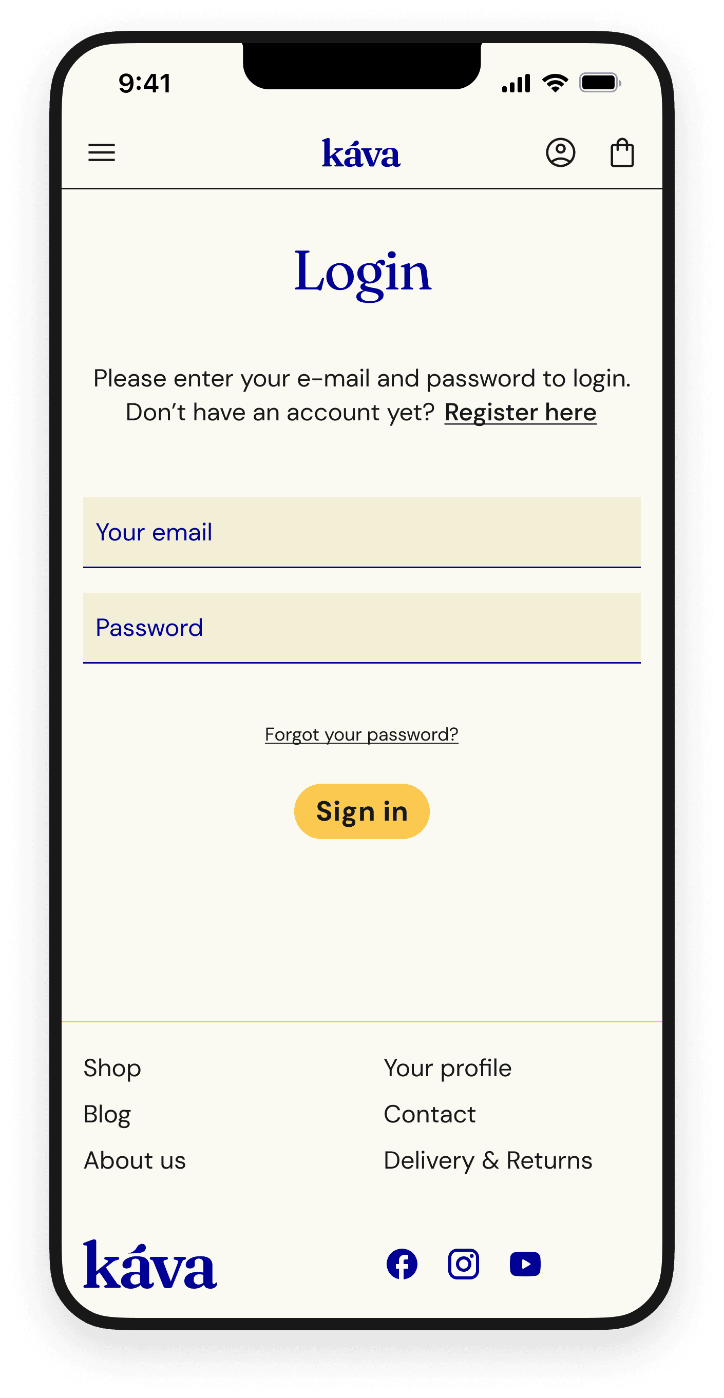
Their preferences are saved in the user profile and can be updated from there.
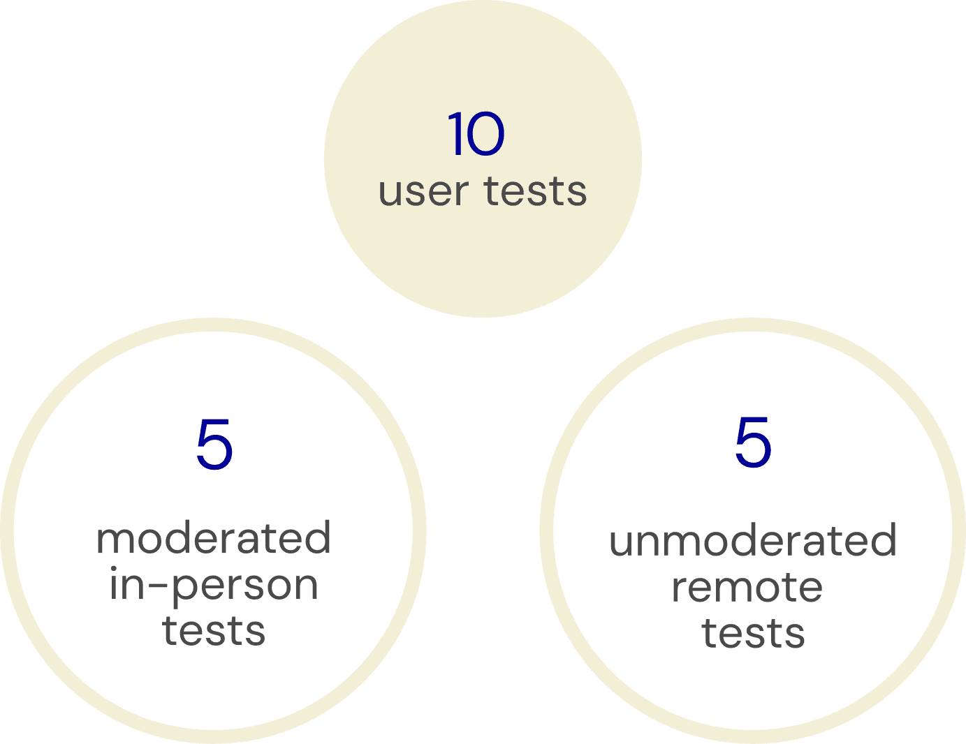
USABILITY TESTING
USERS WERE ASKED TO COMPLETE TWO TASKS:
01
Purchasing a coffee that would match their taste.
90% of users completed the 1st task
02
Updating their coffee preferences in the user profile.
100% of users completed the 2nd task
RECURRING PAIN POINTS
dropdown filter is not easily accessible
dropdown content does not fit in the viewport
overwhelming amount of text presented on a single page
FILTER IMPROVEMENTS
FILTER IMPROVEMENTS
FILTER IMPROVEMENTS
created a module with a short description to make the filter feature stand out
Before
After
substituted dropdown with an overlay
distributed the questions over several screens
added illustrations to break the heavy block of text
Before
After
OTHER IMPROVEMENTS
OTHER IMPROVEMENTS
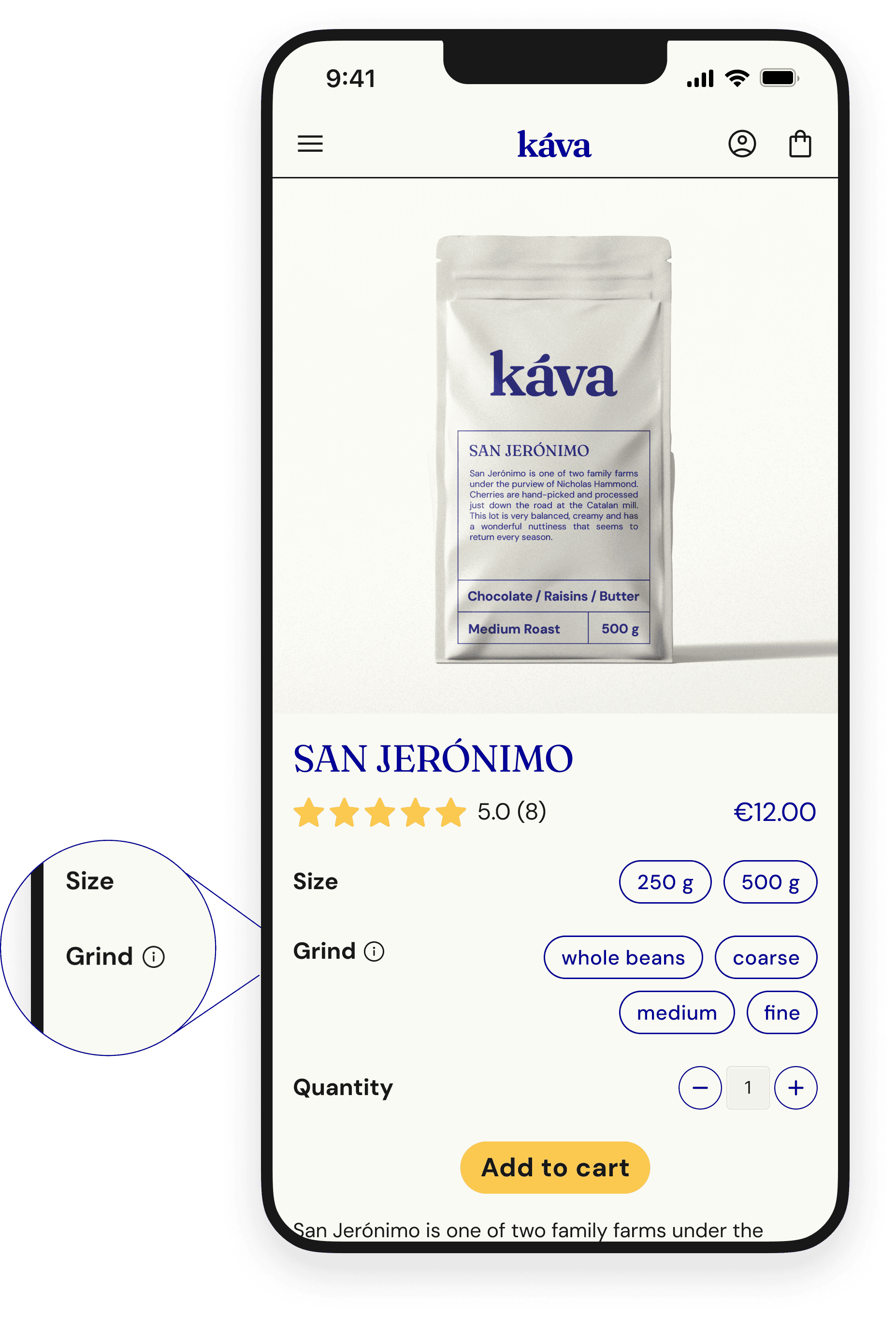
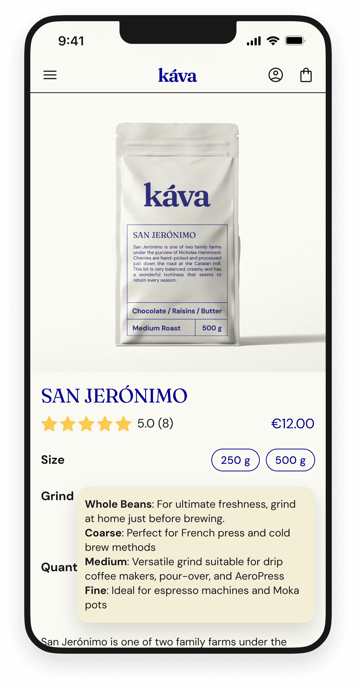
GRIND TOOLTIP
Addition of a tooltip helping the user to choose the right grind based on their brewing method
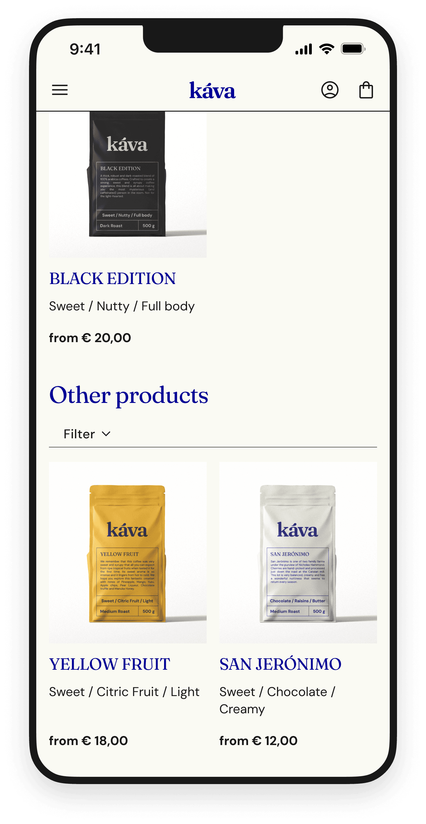
OTHER PRODUCTS
OTHER PRODUCTS
Addition of “Other products” section to the personalised screen so that users can easily browse all products

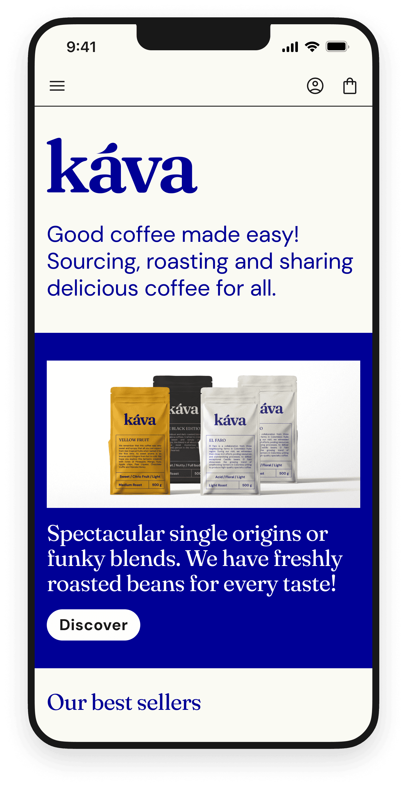
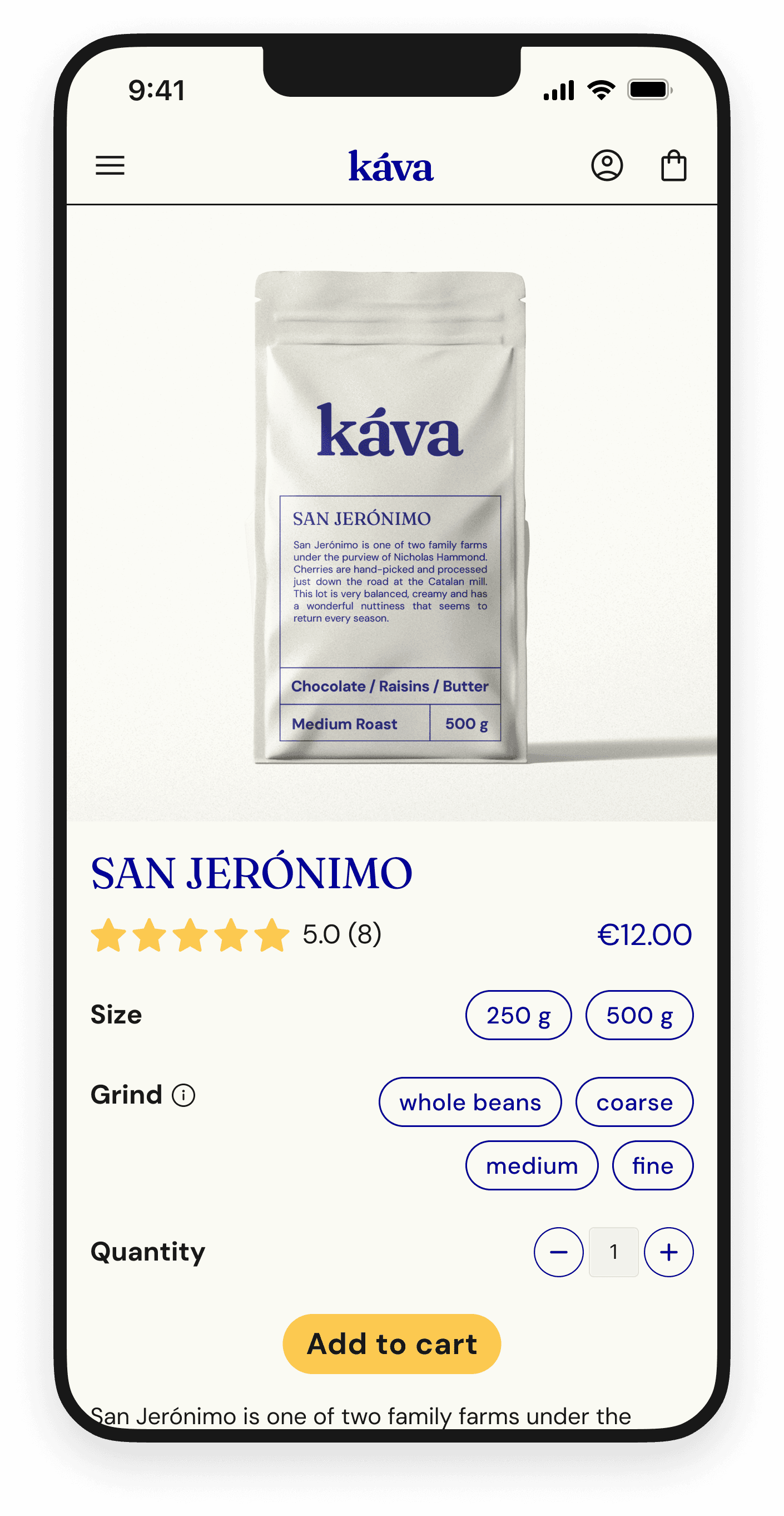
FINAL SCREENS

Next project

Micro-interactions

Flor de Iguana

Desktop & mobile website

Coming soon

Micro-interactions

Flor de Iguana

Desktop & mobile website

Say hello

amelia.rozpedek(at)gmail.com

Say hello

amelia.rozpedek(at)gmail.com

Say hello

amelia.rozpedek(at)gmail.com